HomeBlogBest PracticeUltimate guide to successful UI & UX Design for your marketplace
Ultimate guide to successful UI & UX Design for your marketplace
Marketplace UX design is not the same problem as e-commerce UX design. A single-vendor store […]
Ultimate guide to successful UI & UX Design for your marketplace
- Arnaud
- 12 minutes reading

Marketplace UX design is not the same problem as e-commerce UX design. A single-vendor store only has to make one seller’s catalog easy to browse and buy from. A marketplace has to do that across dozens, hundreds, or thousands of sellers with inconsistent product data, while also convincing a buyer who has never dealt with any of them that the transaction is safe. Get that trust layer wrong, and no amount of visual polish fixes it.
This guide walks through what makes marketplace UX genuinely different, the design decisions that move the needle in practice, and how Origami Studio, our in-house design team, approaches these problems for the platforms we build.
Table of contents
1. Why marketplace UX is a different problem
A marketplace is a two-sided product. Every screen has to work for buyers browsing a catalog they didn’t curate, and for sellers managing a storefront they don’t fully control the platform around. That creates three design constraints a single-vendor store doesn’t face:
- Consistency across inconsistent input. Sellers upload their own photos, write their own descriptions, and set their own prices. Good marketplace UX imposes just enough structure, mandatory fields, image guidelines, standardized categories, to keep the browsing experience coherent without making listing so rigid that sellers give up halfway through.
- Trust between strangers. On a single-vendor store, the buyer trusts the retailer. On a marketplace, the buyer has to trust a seller they’ve never heard of, and the platform has to visibly carry some of that risk, through verification, reviews, buyer protection, or an escrow-style payment flow, before a stranger will hand over their card details.
- A checkout that may span multiple sellers in one order. If a buyer’s cart includes items from three different sellers, the checkout still needs to feel like one transaction, with shipping costs, delivery times, and order tracking split correctly behind the scenes.
Design decisions that ignore these three points tend to produce marketplaces that look fine in a screenshot and fall apart the moment real sellers and real buyers start using them.
2. The four places marketplace UX makes or breaks a sale
Discovery and search
With multiple sellers listing similar or overlapping products, search and filtering carry more weight than on a single-catalog store. Faceted filters (by seller, price, condition, location, delivery time) need to work together, not as a single dropdown, and search results need a way to signal seller reliability alongside relevance, otherwise buyers default to sorting by price alone and undercut sellers who compete on quality or service instead.
Listing and trust signals
A product listing on a marketplace has to answer two questions at once: is this the right product, and can I trust the seller offering it? That means seller ratings, response times, verification badges, and return policies need to sit close to the buy button, not buried on a separate seller profile page the buyer has to go looking for.
Checkout and payments
Marketplace checkout has to handle split payments correctly (routing each seller’s share while the platform retains its commission) without exposing that complexity to the buyer. From the buyer’s side, paying three sellers in one order should feel identical to paying one. Any friction here, unclear shipping costs per seller, a checkout that resets when items come from different sellers, is a direct driver of the cart abandonment problem covered in section 6.
Seller-side experience
It’s easy to design an entire marketplace around the buyer and treat the seller dashboard as an afterthought. That’s a mistake: a confusing listing flow, unclear payout timing, or a dashboard that buries order management under too many clicks drives sellers to competing platforms, and a marketplace with unhappy or absent sellers has nothing for buyers to browse in the first place.
3. Design decisions in practice: what we've built
Rather than talk about UX principles in the abstract, here’s how a few of those decisions have played out on platforms we’ve built:
Preppy Sport, a marketplace for used equestrian equipment, automated onboarding, payment release, and shipment tracking so thoroughly that its founder now runs the entire platform alone, down from a team of six, while the business kept growing to more than 95,000 registered users and over 40,000 active listings. That’s a direct result of design choices that removed manual steps from both the seller and buyer sides of the transaction, not just a backend efficiency story (Preppy Sport case study).
Orpi, a real estate network, needed sellers, its network of independent agencies, to be able to customize how their own listings appeared without touching code. The platform includes a built-in editor that lets each agency adjust its own storefront presentation directly, a concrete example of giving non-technical sellers real design control within a consistent overall template, rather than forcing every seller into an identical, uncustomizable layout (Orpi case study).
TocToc Fishing, a marketplace for fishing equipment, had to solve for a category most marketplace templates don’t handle well: oversized, bulky items with non-standard shipping needs. Designing the listing and checkout flow around that constraint from the start let the platform go live in under three months rather than retrofitting a generic template after launch (TocToc Fishing case study).
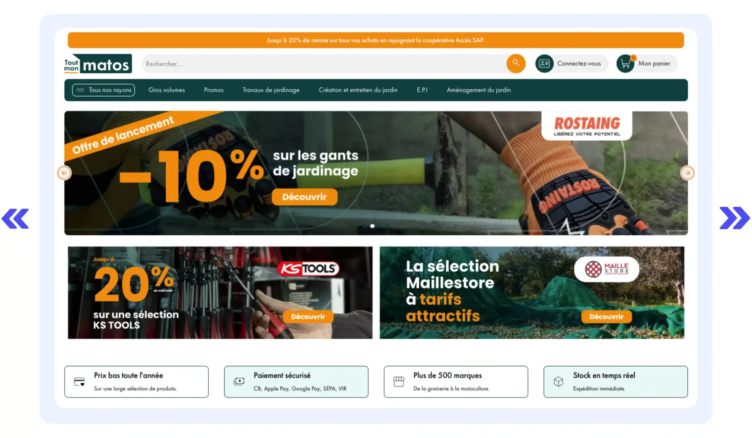
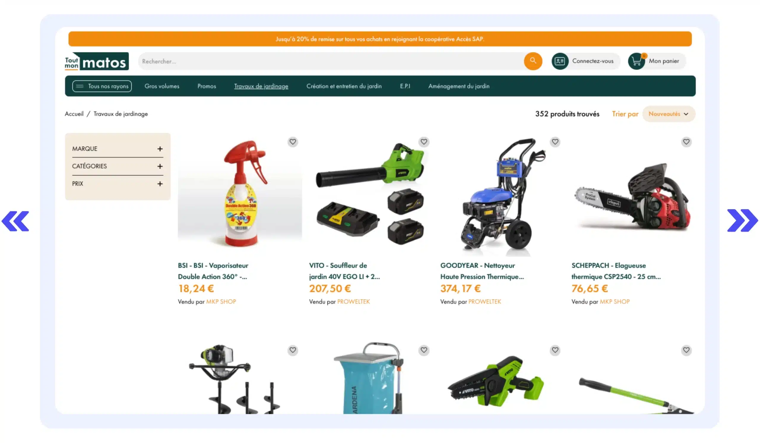
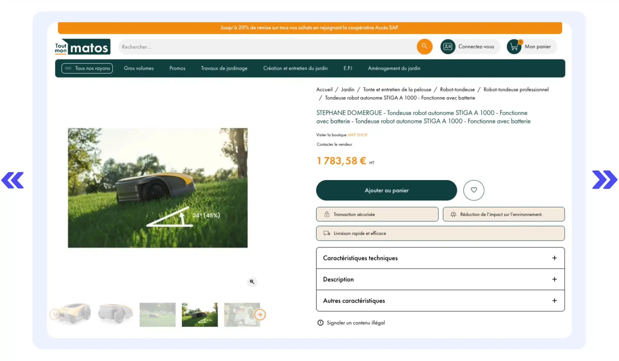
Tout Mon Matos, a marketplace for gardening and outdoor equipment built around a buying cooperative, put seller trust directly into the browsing experience rather than hiding it behind a separate seller page: every listing card in the catalog showed “Vendu par [seller name]” next to the price, and each product page carried a direct link to visit that seller’s own storefront, a “Contact the seller” action, and trust badges for secure payment and fast delivery placed right next to the add-to-cart button. It also built in a “report illegal content” link on every product page, the kind of visible compliance feature EU marketplaces need for the Digital Services Act’s notice-and-action requirements. The marketplace has since ceased operations, but the design choice of putting seller identity directly in the grid instead of burying it on a separate page is a clear, concrete illustration of the trust-signal point made in section 2.
The common thread across all four: the UX decision that mattered most wasn’t a visual one. It was designing the flow around the specific friction point (manual seller operations, non-technical customization needs, an awkward product category, or making seller trust visible at a glance) that would otherwise have blocked adoption.
4. What good marketplace UX looks like
A few widely used marketplaces illustrate specific patterns worth borrowing:
- Airbnb builds trust before a booking ever happens, through identity verification, host response-rate badges, and reviews that are visible before the buyer commits, rather than trust signals that only appear after checkout.
- Etsy leans on rich, seller-written product storytelling, since buyers there are often choosing based on craftsmanship and provenance, not just price, and the listing format is built to support that.
- Vinted keeps its listing flow to a handful of steps (photo, category, price, description) specifically because its sellers are individuals listing casually, not professional merchants, and a long, form-heavy listing flow would kill supply before it ever reached buyers.
None of these are accidents. Each reflects a deliberate choice about what that specific marketplace’s sellers and buyers need most, which is the same question worth asking before copying any single pattern wholesale onto a different kind of marketplace.
Download our free marketplace specifications template.
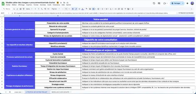
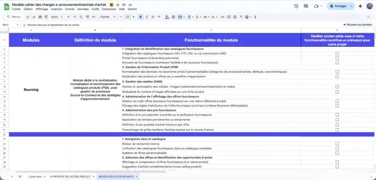
A ready-to-use template to quickly frame your e-procurement or purchasing group project, compare market solutions, and secure your vendor consultation process.
Comprehensive model used in B2C, B2B or C2C projects and ready to adapt.
5. Common UX mistakes on marketplaces
- Treating the seller dashboard as secondary. If listing a product takes ten steps or payout terms aren’t clearly displayed, sellers churn before buyers ever see the effect.
- Hiding fees until checkout. Buyer trust drops fast when a shipping cost or platform fee appears for the first time at the final step, and on a marketplace with multiple sellers in one cart, unclear per-seller costs are a common cause of abandonment.
- Copying single-vendor e-commerce patterns wholesale. A product page template built for one retailer’s catalog often doesn’t have anywhere to put seller identity, ratings, or multi-seller comparison, because it was never designed to.
- Launching without seller-side testing. Buyer-side usability testing is common; testing the listing and dashboard flow with real sellers before launch is not, and it’s usually where the more expensive problems are hiding.
6. Why this is worth the investment
UX decisions on a marketplace checkout have a measurable cost when they go wrong. Baymard Institute, which tracks checkout usability across the industry, puts the average documented cart abandonment rate at 70.22%, based on an aggregate of 50 separate studies, and its own large-scale checkout testing has found that the average checkout flow shows users nearly twice as many form fields as an optimized one needs. Baymard estimates that fixing solvable checkout usability issues could recover roughly $260 billion in lost orders across US and EU e-commerce, a 35.26% potential conversion increase from design changes alone, not from acquiring more traffic (Baymard Institute, Cart Abandonment Rate Statistics).
That number is for e-commerce generally, not marketplaces specifically, and it’s worth reading it that way rather than as a marketplace-specific figure. But a marketplace checkout carries every one of the friction points Baymard identifies (unclear costs, a complicated flow, trust concerns about handing over payment details) plus the added complexity of splitting a single order across multiple sellers. If anything, that makes checkout design scrutiny more important on a marketplace, not less.
7. How Origami Studio can help
Design isn’t an afterthought we outsource once the platform is built. Origami Studio is our in-house team dedicated to the front-end and design side of every marketplace we build, and it covers three distinct paths depending on what you need:
- Turnkey, low-code customization. Ready-to-use themes you can adapt with your own branding, colors, and layout choices, built mobile-first, without needing a development team to launch a marketplace that looks and feels like yours rather than a generic template.
- CMS-hybrid architecture. For teams that want their marketplace’s front end built on a CMS they already know, Shopify, Magento, or PrestaShop, paired with Origami’s marketplace-specific back end for multi-seller logistics, payments, and catalog management.
- Headless, API-first design. For teams with their own development resources who want full control over the front-end experience while relying on Origami’s APIs for the marketplace mechanics underneath.
Multilingual and multi-currency support is built into all three paths, which matters as soon as a marketplace sells across more than one country.
For projects that need design work beyond what Origami Studio’s in-house team and toolkit cover, custom illustration, a full brand identity build, or specialized accessibility auditing, we can also bring in partner agencies we’ve worked with before. That’s the exception, not the default: most of the marketplaces we build get their design work done by Origami Studio directly (front-end and design options for marketplaces).
If you’re scoping a project and want to talk through which of these three paths fits, our team can walk through it with you, no obligation.
Do you want to build an agile and future-proof platform?
Let’s discuss it. our expertise extends beyond the tool as we help you structure your project with the right methodology to guarantee its success.

Frequently asked questions
A marketplace has to design for two audiences at once, buyers and sellers, and has to build trust between strangers who’ve never transacted before, rather than just trust in a single retailer. It also has to keep the buying experience consistent across many sellers’ inconsistent product data, and handle checkout when an order includes items from multiple sellers.
There’s no single universal answer, it depends on what’s actually blocking adoption on your specific platform. For Preppy Sport, it was automating manual seller operations. For TocToc Fishing, it was designing around an unusual product category from day one. The pattern that matters is diagnosing your specific friction point rather than copying a generic best-practices checklist.
It depends on your timeline and how differentiated your design needs to be. A turnkey, low-code theme gets you to launch fastest and still allows real branding and customization. A fully custom, headless build gives you complete design control but takes longer and needs in-house development resources. Most teams launching their first marketplace start with the faster path and revisit custom design once the platform has proven demand.
Yes, though the clearest data on this comes from checkout research generally rather than marketplaces specifically. Baymard Institute’s research puts the average cart abandonment rate at 70.22% and estimates that solvable checkout usability issues account for a 35.26% potential conversion increase across the e-commerce sites it studies. Marketplace checkouts carry the same friction points, plus the added complexity of splitting an order across sellers, which is reason to take checkout design at least as seriously.